
2018 Tesla Model 3 interior
Last Updated:

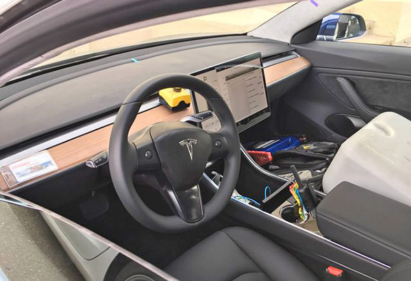
These are , so far, the best pictures of the interior of the new Tesla Model 3 I have ever seen.
And no real surprises.
As we have seen before, they’ve added a wood trim to the dash. And some metal bits here and there. Otherwise the design of the early prototypes hasn’t changed much.
It’s either “clean’ or “spartian”. Also “boring” and “cold” could be used.
Depending on your point of view.
That super simple dash is kind of original. In its hyper simplicity. But the rest of the interior (doors, console) is really boring and uninventive. It could be from any “much cheaper” car.
This is no Volvo interior for sure….
Tesla is just not trying hard enough here. And while the exterior is nice, it’s just a smaller version of the Model S.
The only new feature inside is that giant unique screen.
Which, I think, is actually pretty gimmicky.
I hate the lack of any physical button/knobs at all. In any car. At least radio volume needs one.
That whole interior feels like a hospital room. Even with “wood added”.
We’ll see…..
Just 2 steering wheel buttons, that's kind of strange. What's is their exact function? Scrolls buttons for the large screen?
Holy shit.. that screen is big!
Where are the HVAC vents? In the gap between the upper dash and the metal.chrome band?
An iPad Pro does not make a proper instrument cluster, especially when not directly in front of the driver. This is giving my Scion and Toyota Echo nightmares. I like to have the essentials in front of me so I can look down , not to the right.
I'm ready to cancel my order if this is the final design. A central iPod screen is ridiculous, and the rest is simply ugly and uninspired.