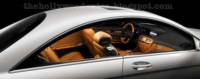
the exterior is totally HOT, but I think MB is making a big mistake on using that boring S-Class (aka 7-Series wannabe) interior.
The dashboard is nasty, but everything else looks sweet, especially under studio lighting. The CL is really good-looking, and I love the shape of the rear window.
Just imagine if Lincoln had cared enough to make it’s Mark series this good.
Big pimpin spendin Gs, I got yo bitches down on they knees
Good mix and match. Space ship dashboard, Italian style leather seats, and British Wood quality mix together like designer’s dream. But I wish that they can push the engine further back to make the proportion closer to SLR. This car is for two people anyways why bother to make the back seats so comfortable …
I still prefer the previous CL. Seeing the new CL in person should change my opinion. Though the new CL does looks good in darker color. I am also not a fan of Mercedes latest interior. The new command system elimate many buttons and knobs and end up makiing the interior bland looking.
The rear window framing is unique but just won’t mesh with the side window frame shape. The interior is :-/…..
I love the front and sides-very well shaped and proportioned.
What the hell?
That second photo of the Merc – same lights as the new Lexus LS. Dont deny it.
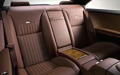
This car looks amazing! Not sure about all those V12 logos inside though…
the CLS interior is far more attractive.
i like the interior better than the exterior but nice car, i like this interior better than the cls it looks good but the dash looks like the previous generation xk, as does the basic interior theme. but very nice car, the v12 badges everywhere is a little much, but seems just as nice as the bentley gt and other cars in this segment
this car is the defenition of luxury sport.
Ah, now I can see it…the front end design was inspired by the RX-8. Not good. And that side shot is hideous, complete with the character line gash that seems to be becoming a company-wide trademark. Ghastly clashing interior wood trim, but I do like the shape of the rear window. Overall, it just looks like they were trying too hard.
the front 3/4 are pure sex- as for the back, its a combination of crap – 1930s coupe styling meets ford taurus.
I like it but agree that the dash is “eh, just okay” … but, the ‘double hood’ in the Merc is more pleasing than the double hood in the BMW’s — there’s are like, “Oh crap, we went out for pizza and forgot to consider the Nav area.”


the exterior is totally HOT, but I think MB is making a big mistake on using that boring S-Class (aka 7-Series wannabe) interior.
The dashboard is nasty, but everything else looks sweet, especially under studio lighting. The CL is really good-looking, and I love the shape of the rear window.
Just imagine if Lincoln had cared enough to make it’s Mark series this good.
Big pimpin spendin Gs, I got yo bitches down on they knees
Good mix and match. Space ship dashboard, Italian style leather seats, and British Wood quality mix together like designer’s dream. But I wish that they can push the engine further back to make the proportion closer to SLR. This car is for two people anyways why bother to make the back seats so comfortable …
I still prefer the previous CL. Seeing the new CL in person should change my opinion. Though the new CL does looks good in darker color. I am also not a fan of Mercedes latest interior. The new command system elimate many buttons and knobs and end up makiing the interior bland looking.
The rear window framing is unique but just won’t mesh with the side window frame shape. The interior is :-/…..
I love the front and sides-very well shaped and proportioned.
What the hell?
That second photo of the Merc – same lights as the new Lexus LS. Dont deny it.
This car looks amazing! Not sure about all those V12 logos inside though…
the CLS interior is far more attractive.
i like the interior better than the exterior but nice car, i like this interior better than the cls it looks good but the dash looks like the previous generation xk, as does the basic interior theme. but very nice car, the v12 badges everywhere is a little much, but seems just as nice as the bentley gt and other cars in this segment
this car is the defenition of luxury sport.
Ah, now I can see it…the front end design was inspired by the RX-8. Not good. And that side shot is hideous, complete with the character line gash that seems to be becoming a company-wide trademark. Ghastly clashing interior wood trim, but I do like the shape of the rear window. Overall, it just looks like they were trying too hard.
the front 3/4 are pure sex- as for the back, its a combination of crap – 1930s coupe styling meets ford taurus.
I like it but agree that the dash is “eh, just okay” … but, the ‘double hood’ in the Merc is more pleasing than the double hood in the BMW’s — there’s are like, “Oh crap, we went out for pizza and forgot to consider the Nav area.”