
Chevrolet’s bowtie logo turns 100
Last Updated:
All I have to say is that it is time for the bowtie to turn silver again.
Forget the cheesy gold!
Silver for everything, and blue for electric cars.
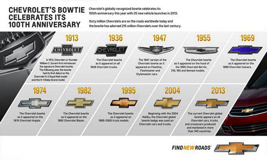
From this picture it looks like it turned gold in 1982. We are in 2013, it’s time to get rid of gold.
1936 black one is kinda cool
Silver? Sorry Vince, but there is no more boring generic color. Look at the current drab shield on the Buick for reference.
The 1947 and 1955 logos look best and have style.
The current logo is boring, but they are making them so large that the logo makes the cars look stupid. It's like they come out of the full size truck parts bin and slap them on a Cruze or Spark.
Thankfully you can remove them from the rear, but that hugely obnoxious logo on the grille is there.
No one with taste likes gooooooold. It's nasty and pretentious.
Gold (orangish brass really) is not a good color for a logo. Honda and Toyota stopped selling the gold logo treatment for a reason. It's outdated and cheap looking.