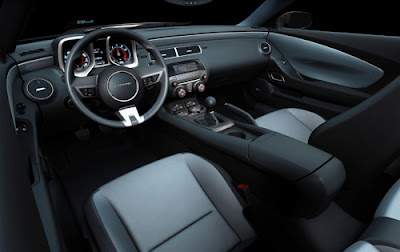
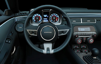
2010 Camaro interior
Last Updated:


I think this is one of the best looking interior I have seen in a while.
Especially considering the “low 20’s” starting price of the car.
It is both futuristic and retro, with tons of personality.
Again,I just can’t wait for this car.

Burlapp, you like the tachs? Personally, it would have been nicer if they placed them above the center air vents. This doesn’t have paddle shifters.
Pretty faithful to the concept, something that can’t be said about the challenger’s dash, especially since the challenger concept’s dash was more “production ready.”
First off I love the exterior design. As for this interior, ehhh. First off too much chrome on around the speddo and on the wheel. What’s with those two knobs below the radio? Horrible. What I do like is how seamless the dash integrates into the door. I like the beltline at the top of the dash. Going from the driver doors heading to the center console it’s nice and clean. Then we get to what seems to be a bit of everything from the GM parts bin just tossed in chunks. It’s a mess.
I think Chevrolet did a far better job with their execution on the retro Camaro than Dodge did with their Challenger. I would definitely choose the Camaro over the Challenger.
nice!
This Camaro blends retro with current quite nicely, something Lincoln was never able to do with their own retro interior styling of the MKZ and Navigator.
This is wonderful! UNLIKE THE POS, SALVAGED-FROM-THE-JUNK-YARD CHALLENGER INTERIOR. CHRYSLER’S DAYS ARE SOON TO BE OVER…
That display panel above what I’m guessing is the stereo looks pretty cool. Nice job GM. Looks awesome, though I would never consider buying it in a million years.
There’s no paddle shifter because it’s not an automatic! Beautiful! Can’t wait to buy mine!!
Nice, but will it be enough to save GM??
Just tone down the two big squares. Pinto, how did you come up with that? Did you own one?
It will not age well
Dude! These are paintings. Where are the real photos?
I thought I recognized the design – its obviously inspired by the Ford Pinto dashboard..https://www.flickr.com/photos/joeross/1143575607/